As the CFO of our organization, I’m using MS Power BI for data analysis, even more than Excel these days. We highlight the importance of utilizing the slicer function, which allows us to examine data in a more meaningful manner. To simplify the process, I have condensed the information from Microsoft’s website on slicers into the following:
To effectively track the performance of our salespeople, specifically the district managers as an example, and compare the achievement against our plan, we need granular data and good visualization.
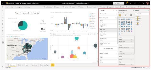
Slicers serve as an easy method for refining the data displayed on the canvas based on dimensional columns. Users of the dashboard can select one or more values from a list to “slice” the data accordingly. Slicers also function as a visualization type. In contrast, filters, which are extensively used in Excel, are employed to refine specific visuals, entire pages, or entire workbooks.
Getting Started With Power Bi:
- Create separate reports or comparative charts: We can develop distinct reports or charts that showcase the overall sales metrics and the performance of individual district managers. This allows us to easily compare and analyze the data.
- Use filters in the Filters pane: Add filters in the Filters pane and these filters let us apply specific criteria to narrow down the displayed data. By applying filters based on district managers or time frames, readers can focus on the relevant information for their respective business units.
- Prepare for Slicing: Slicers offer an alternative way to filter your sales data. They are displayed on the report page and allow users to narrow down the dataset shown in other visualizations. Slicers are very useful when we want to display commonly used or important filters on the report canvas for easy access (such as how are people across various segments performing). They also enable us to view the current filtered state without having to open a drop-down list.
When slicing, we control the visuals affected by the slicer. For example, we may want to keep certain visualizations unaffected by the slicer selections to maintain overall comparative data.
Start Slicing:
- Open Power BI Desktop and access the desired report.
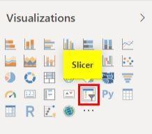
- Select the Slicer icon in the Visualizations pane.
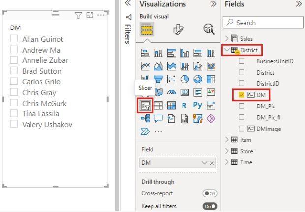
- From the Fields pane, choose the relevant field, such as “District Manager,” to populate the slicer.
- Select names on the slicer to observe their effects on other visualizations. Hold down the Ctrl key to select multiple names.
You can also customize the interaction between slicers and other visuals on the page. By default, slicers affect all other visualizations on the same page.
This is pretty helpful: it is possible to synch slicers across multiple pages in a report. This ensures that slicer selections made on one page impact visualizations on other pages, offering a consistent filtering experience. The Sync slicers feature can be used to sync slicers between different pages in Power BI Desktop or Power BI service.
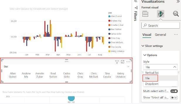
To maximize the cashflow, the practical application for our SaaS company can be: slicing to present the metrics of “Total Sales variance by Fiscal year of District Managers.” Additionally, we can represent the District Manager list by Title and Dropdown for even more clarity.
Excel will always be around yet visualization and manipulation of the data is better with Power Bi. Slicers provide a great way to improve the usability and interactivity of finance reports, enabling readers to easily analyze and compare sales metrics for different district managers and time frames. We can use slicers frequently to obtain granular data on sales performance versus our plan, breaking it down by region, area, and other segmentations. Slicers in Power BI also enable users to interactively filter data across multiple visuals, ensuring a consistent view of metrics and trends.